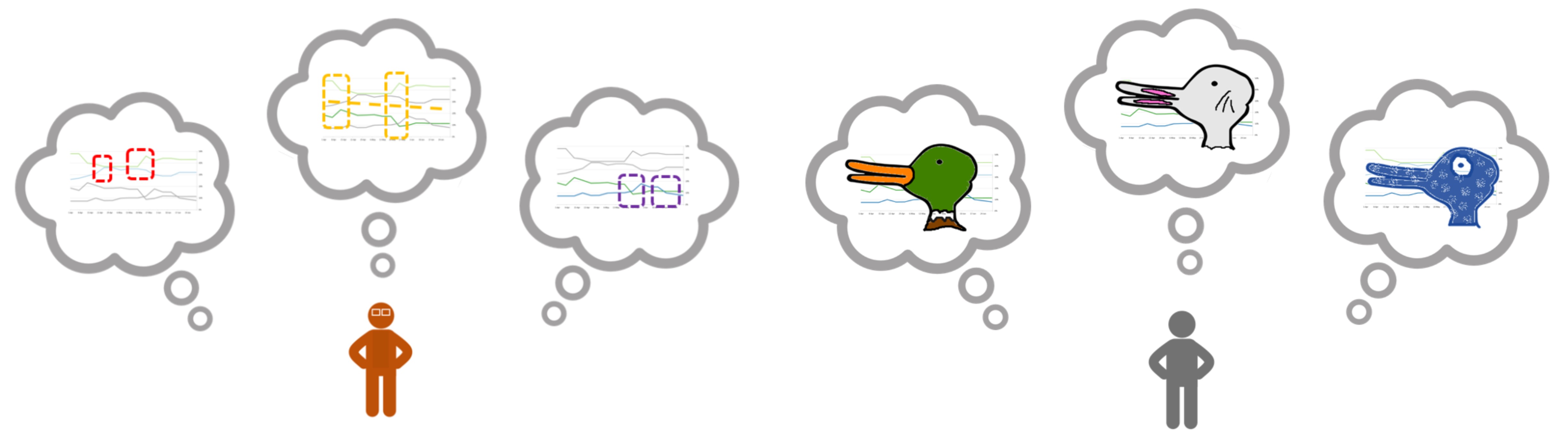
A viewer can extract many potential patterns from any set of visualized data values. But that means that two people can see different patterns in the same visualization, potentially leading to miscommunication.
More here.
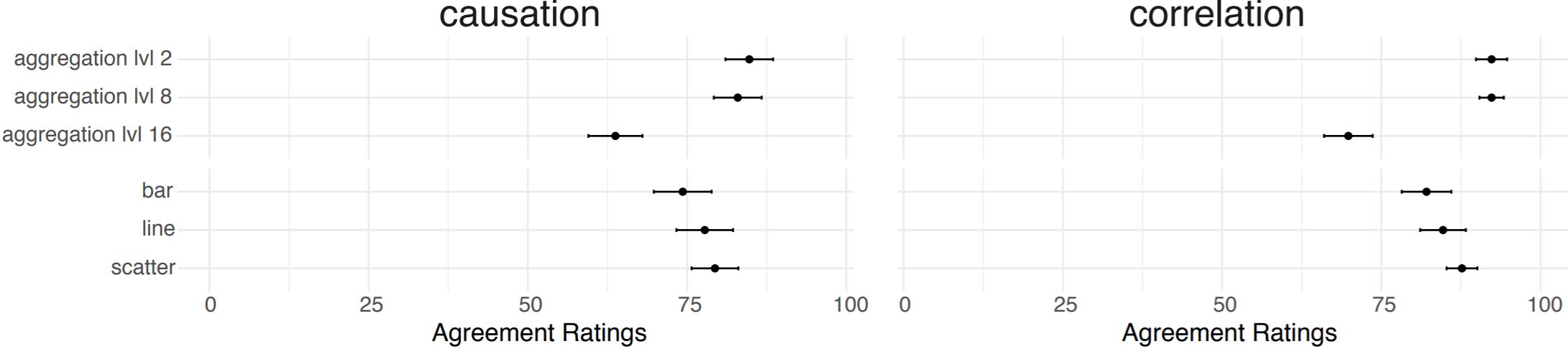
Levels of support for the causal interpretation were not equally strong across visualization types.
Level of aggregation was one driving factor of higher perceived causality. Bar encoding marks were perceived to be less causal than line and dot encodings.
More here.