IEEE VIS 2024
How Aligned are Human Chart Takeaways and LLM Predictions? A Case Study on Bar Charts with Varying Layouts
Huichen Will Wang, Jane Hoffswell, Sao Myat Thazin Thane, Victor S Bursztyn, Cindy Xiong Bearfield
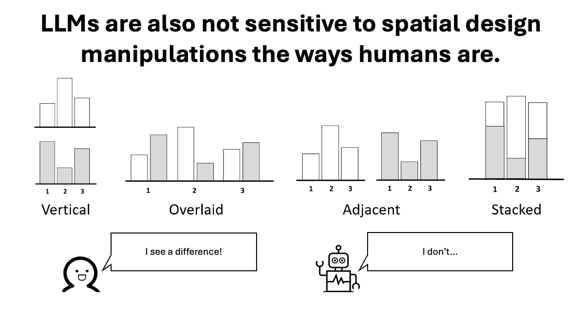
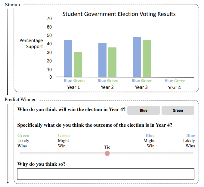
State-of-the-art LLMs can struggle to generate semantically diverse and factually accurate takeaways from visualizations. The takeaways LLMs generate are significantly different from what humans would generate. LLMs also compare a different set of data points than humans do, because LLMs are not sensitive to spatial design manipulations the ways humans are.
IEEE VIS 2024
Motion-based visual encoding can improve performance on perceptual tasks with dynamic time series
Songwen Hu, Ouxun Jiang, Jeffrey Riedmiller, Cindy Xiong Bearfield
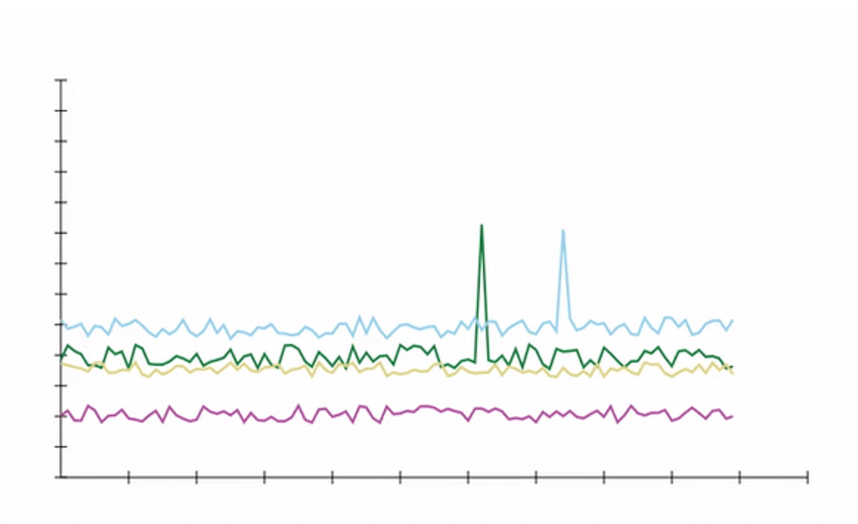
Dynamic data visualizations can convey large amounts of information over time. We show that tracing and staging techniques can improve people's performance in visual analysis tasks such as finding means and variances in a visualization. People also preferred display time to be three times shorter when staging is used. The supplementary materials can be found at https://osf.io/8c95v/
IEEE VIS 2024
Gridlines Mitigate Sine Illusion in Line Charts
Clayton Knittel, Jane Awuah, Steve Franconeri, Cindy Xiong Bearfield
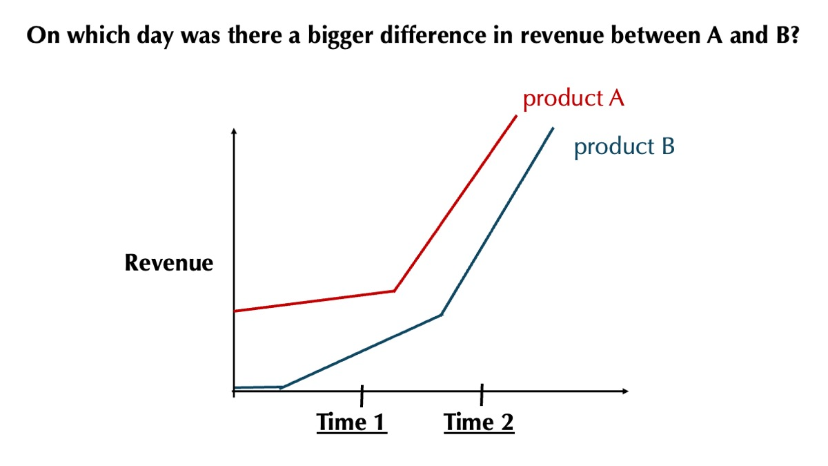
The sine illusion is an underestimation of the difference (deltas) between two lines when both lines have increasing slopes. This illusion happens because participants are mistakenly comparing orthogonal deltas, rather than the vertical deltas between the two lines. When the ratio of the deltas is less than 50%, participants begin to be influenced by the sine illusion. This effect can be significantly exacerbated when the difference between the two deltas falls under 30%.
[PDF]
PacificVis 2024
Same Data, Diverging Perspectives: The Power of Visualizations to Elicit Competing Interpretations

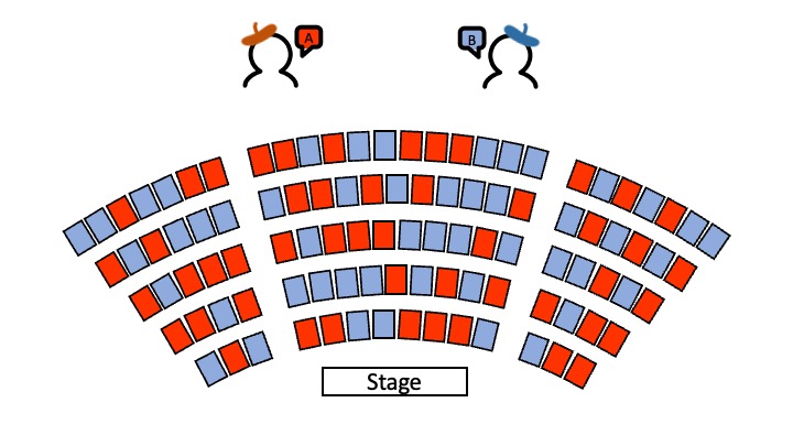
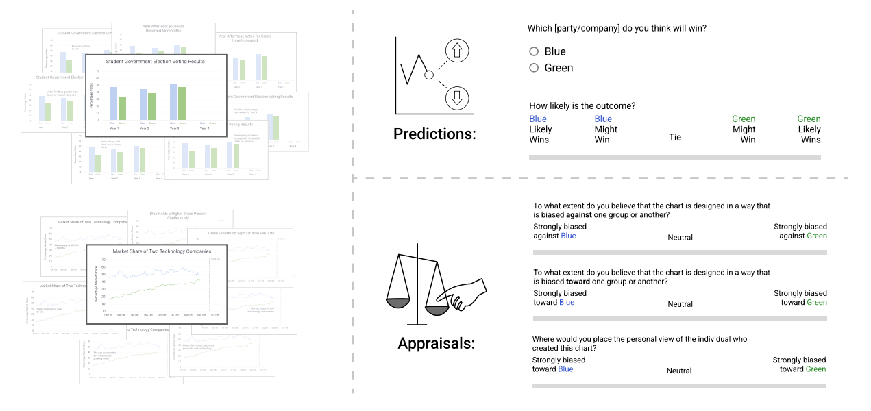
People routinely rely on data to make decisions, but the process can be riddled with biases. We demonstrate that viewer interpretation of data is similar to that of ‘ambiguous figures’ such that two people looking at the same data can come to different decisions. In our studies, participants read visualizations depicting competitions between two entities, where one has a historical lead (A) but the other has been gaining momentum (B) and predicted a winner, across two chart types and three annotation approaches. They either saw the historical lead as salient and predicted that A would win, or saw the increasing momentum as salient and predicted B to win. These results suggest that decisions can be influenced by both how data are presented and what patterns people find visually salient.
[PDF]
TVCG 2023
The Role of Text in Visualizations: How Annotations Shape Perceptions of Bias and Influence Predictions
Chase Stokes, Cindy Xiong Bearfield, and Marti A. Hearst
Two empirical studies were conducted based on two tasks (predicting data trends and appraising bias) using two visualization types (bar and line charts). While the addition of text had a minimal effect on how people perceive data trends, there was a significant impact on how biased they perceive the authors to be. This finding revealed a relationship between the degree of bias in textual information and the perception of the authors’ bias. Exploratory analyses support an interaction between a person’s prediction and the degree of bias they perceive. We highlight the need for designers to mitigate potential polarization of readers’ opinions based on how authors’ ideas are expressed.
[PDF]
TVCG 2023
What does the chart say? grouping cues guide viewer comparisons and conclusions in bar charts
Cindy Xiong Bearfield, Chase Stokes, Andrew Lovett, and Steven Franconeri
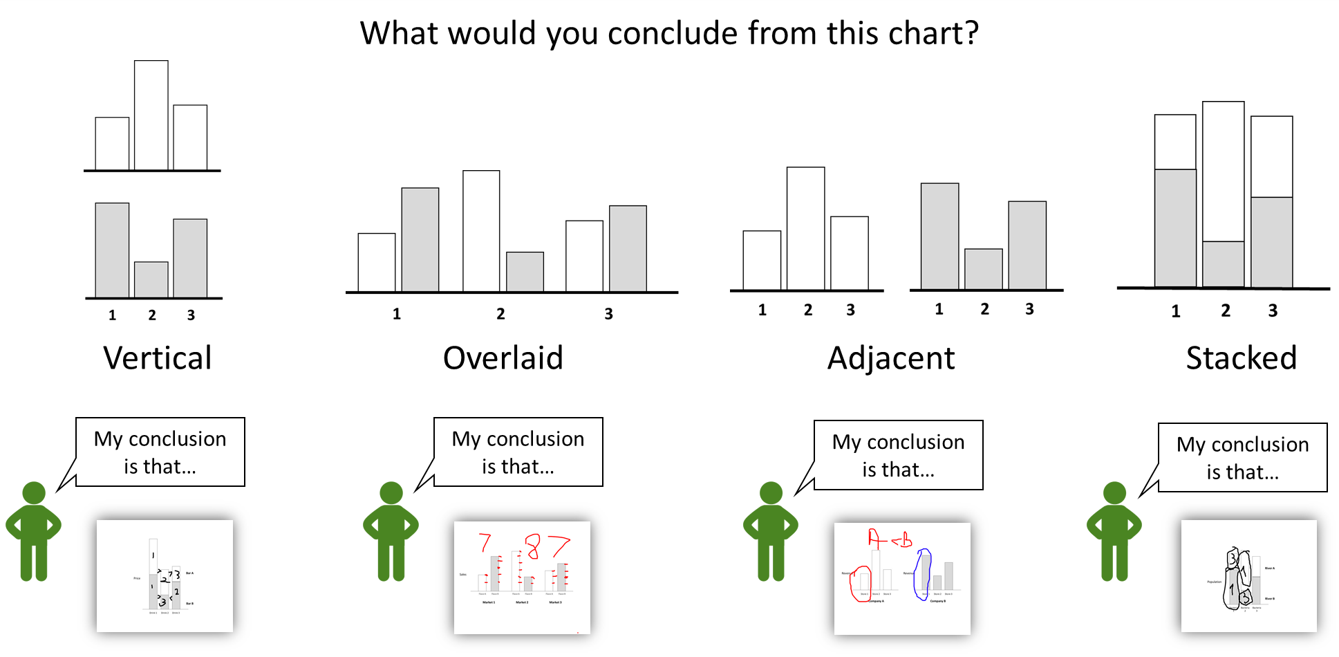
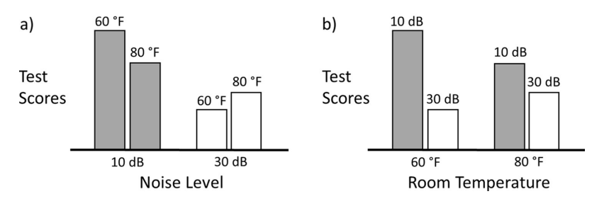
Reading a visualization is like reading a paragraph. Each sentence is a comparison: the mean of these is higher than those; this difference is smaller than that. What determines which comparisons are made first? The viewer’s goals and expertise matter, but the way that values are visually grouped together within the chart also impacts those comparisons. We create a visual comparison taxonomy that allows us to develop and test a sequence of hypotheses about which comparisons people are more likely to make when reading a visualization. We find that people tend to compare two groups before comparing two individual bars and that second-order comparisons are rare. Visual cues like spatial proximity and color can influence which elements are grouped together and selected for comparison, with spatial proximity being a stronger grouping cue. Interestingly, once the viewer grouped together and compared a set of bars, regardless of whether the group is formed by spatial proximity or color similarity, they no longer consider other possible groupings in their comparisons.
[PDF]
IEEE VIS 2023
Polarizing Political Polls: How Visualization Design Choices Can Shape Public Opinion and Increase Political Polarization
Eli Holder and Cindy Xiong Bearfield
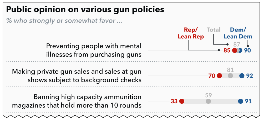
Could design or framing choices interact with viewers’ social cognitive biases in ways that promote political polarization? When reporting on U.S. attitudes toward public policies, it is popular to highlight the gap between Democrats and Republicans (e.g. with blue vs red connected dot plots). But these charts may encourage social-normative conformity, influencing viewers’ attitudes to match the divided opinions shown in the visualization. We found that data visualizations can induce social conformity and accelerate political polarization. Choosing to visualize partisan divisions can divide us further.
[PDF]
IEEE VIS 2023
My Model is Unfair, Do People Even Care?
Visual Design Affects Trust and Perceived Bias in Machine Learning
Aimen Gaba*, Zhanna Kaufman*, Jason Cheung, Marie Shvakel, Kyle Wm. Hall, Yuriy Brun, and Cindy Xiong Bearfield
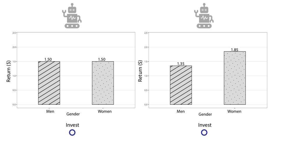
Suppose you are picking between two robot advisors, and one has historically made 10% return for its users, while the other 8%. Which robot would you choose? What if you learn that the first robot has exhibited sexist behavior, making higher returns for men than for women? Does that change your choice? This paper aims to understand how bias and effectiveness of data-driven systems affects users' trust in those systems. We find that describing system behavior using text rather than bar charts leads to people putting more weight on bias, and explicitly labeling a system as biased has more effect than showing a history of biased behavior.
[PDF]
IEEE VIS 2023
Vistrust: a Multidimensional Framework and Empirical Study of Trust in Data Visualizations
Hamza Elhamdadi, Adam Stefkovics, Johanna Beyer, Eric Moerth, Hanspeter Pfister, Cindy Xiong Bearfield, Carolina Nobre
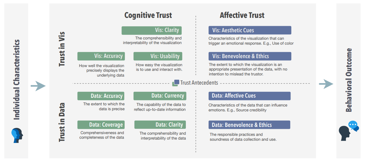
Trust is an essential aspect of data visualization, as it plays a crucial role in the interpretation and decision-making processes of users. We propose a multidimensional operationalization of trust in visualization by applying general theories of trust from social sciences, as well as synthesizing and extending earlier work and factors identified by studies in the visualization field. Our study provides empirical evidence for several aspects of our proposed theoretical framework, most notably the impact of cognition, affective responses, and individual differences when establishing trust in visualizations.
[PDF]
IEEE TVCG 2022
Reasoning Affordances with Tables and Bar Charts
Cindy Xiong, Elsie Lee-Robbins, Icy Zhang, Aimen Gaba, Steven Franconeri
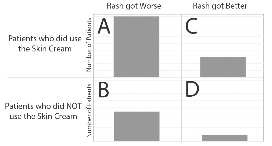
We tested whether confirmation bias exists when people reason with visualized data and whether specific visualization designs can elicit less biased reasoning strategies. Confirmation bias was not significantly present when beliefs were primed, but it was present when beliefs were pre-existing. The tabular presentation format was more likely to afford the ratio reasoning strategy, and the use of the ratio strategy was more likely to lead to the correct answer.
[PDF]
IEEE Computer Graphics and Applications 2022
 VisHikers’ Guide to Evaluation: Competing Considerations in Study Design
Emily Wall, Cindy Xiong, Yea-Seul Kim
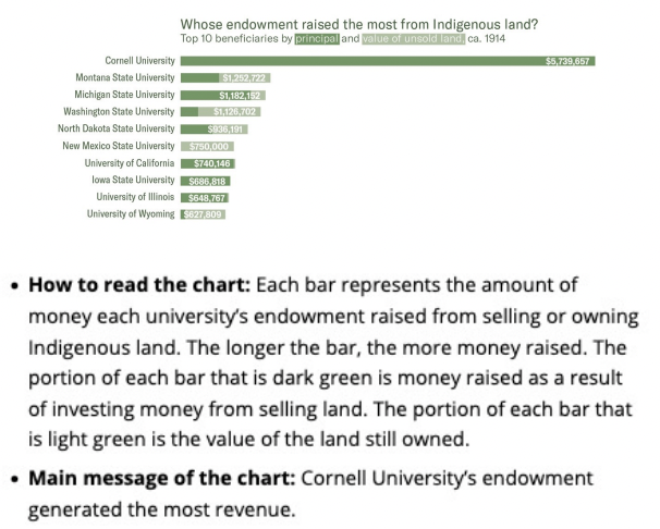
We describe the persistent tensions between various camps on the “right” way to conduct evaluations in visualization. *Best Paper Runner-Up for IEEE CG&A*
[PDF]
IEEE TVCG 2022
From Invisible to Visible: Impacts of Metadata in Communicative Data Visualization
Alyxander Burns, Christiana Lee, Thai On, Cindy Xiong, Evan Peck, Narges Mahyar
Leaving the context of visualizations invisible can have negative impacts on understanding and transparency. Recontextualizing visualizations with metadata (e.g., disclosing the data source or instructions for decoding the visualizations' encoding) may counter these effects. Our experiments suggested that visualizations with metadata were perceived as more thorough than those without metadata. Metadata influence which information participants remembered as important or interesting.
IEEE VIS 2022
How Do Viewers Synthesize Conflicting Information from Data Visualizations?
Prateek Mantri, Hariharan Subramonyam, Audrey L. Michal, and Cindy Xiong
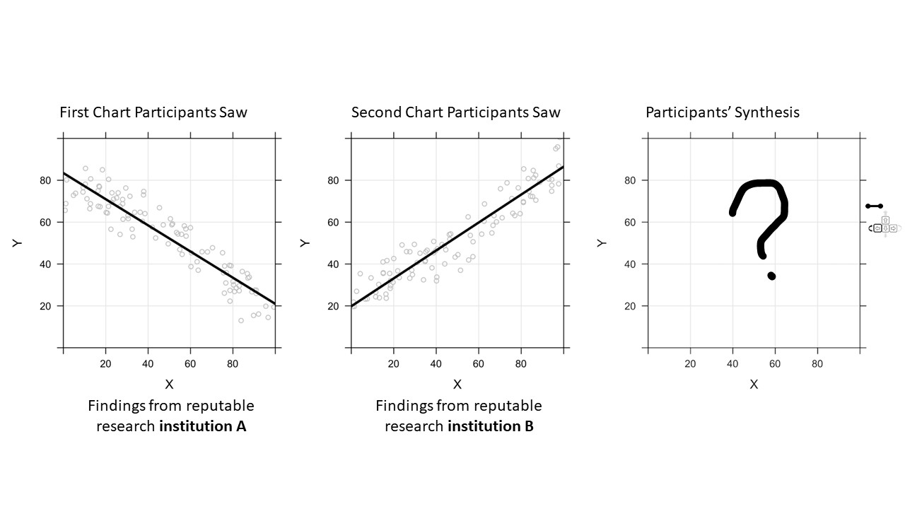
Scientific knowledge develops through cumulative discoveries that build on, contradict, contextualize, or correct prior findings. Consequently, readers need to integrate diverse and contrasting evidence from multiple sources to form opinions or make decisions. However, the underlying mechanism for synthesizing information from multiple visualizations remains under-explored. We conducted a series of experiments to address this gap.
[PDF]
IEEE VIS 2022
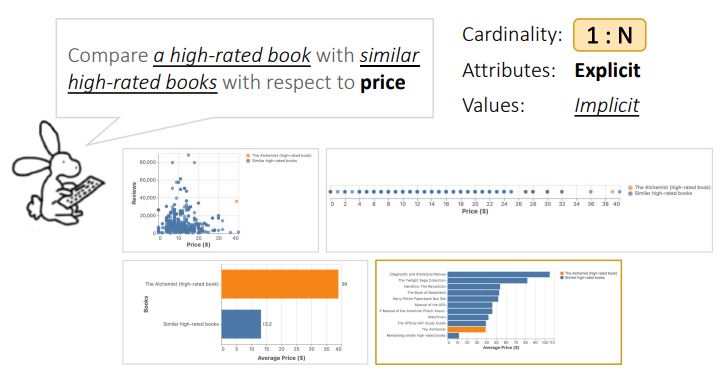
Comparison Conundrum and the Chamber of Visualizations: An Exploration of How Language Influences Visual Design
Aimen Gaba, Vidya Setlur, Arjun Srinivasan, Jane Hoffswell, and Cindy Xiong
The language for expressing comparisons is often complex and nuanced, making supporting natural language-based visual comparison a non-trivial task. To better understand how people reason about comparisons in natural language, we explore a design space of utterances for comparing data entities. We identified different parameters of comparison utterances that indicate what is being compared (i.e., data variables and attributes) as well as how these parameters are specified (i.e., explicitly or implicitly).
[PDF]
IEEE VIS BELIV 2022
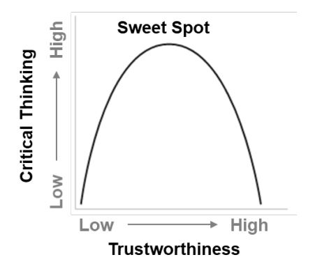
How Do We Measure Trust in Visual Data Communication?
Hamza Elhamdadi, Aimen Gaba, Yea-Seul Kim, Cindy Xiong
Trust is fundamental to effective visual data communication between the visualization designer and the reader. Although personal experience and preference influence readers’ trust in visualizations, visualization designers can leverage design techniques to create visualizations that evoke a “calibrated trust,” at which readers arrive after critically evaluating the information presented. To systematically understand what drives readers to engage in “calibrated trust,” we must first equip ourselves with reliable and valid methods for measuring trust.
IEEE VIS 2022
Dispersion vs Disparity: Hiding Variability Can Encourage Stereotyping When Visualizing Social Outcomes
Eli Holder and Cindy Xiong
Visualization research often focuses on perceptual accuracy or helping readers interpret key messages. But when designed poorly, data visualizations about social inequity can be misinterpreted in harmful ways and lead to stereotyping. Design choices can influence these biases: Hiding variability tends to increase stereotyping while emphasizing variability reduces it.
IEEE VIS 2022
Seeing What You Believe or Believing What You See? Belief Biases Correlation Estimation
Cindy Xiong, Chase Stokes, Yea-Seul Kim, Steven Franconeri
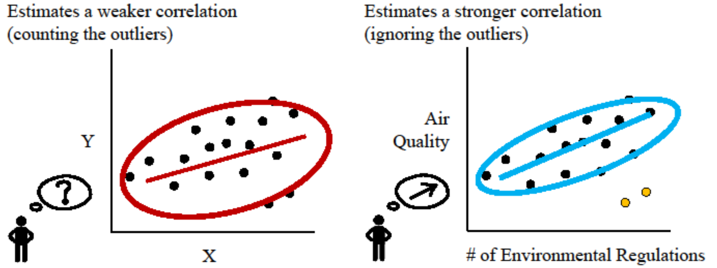
When an analyst or scientist has a belief about how the world works, their thinking can be biased in favor of that belief. When viewers believed that two variables should have a strong relationship, they overestimated correlations between those variables by an r-value of about 0.1. When they believed that the variables should be unrelated, they underestimated the correlations by an r-value of about 0.1.
ACM CHI 2022
🏆 Investigating Perceptual Biases in Icon Arrays
Cindy Xiong, Ali Sarvghad, Çağatay Demiralp, Jake M. Hofman, Daniel G. Goldstein
Icon arrays are graphical displays in which a subset of identical shapes are filled to convey probabilities. They are widely used for communicating probabilities to the general public. We investigated the effect of different arrangements in icon arrays on probability perception. *Honorable Mention at CHI 2022*
[PDF]
IEEE TVCG 2022
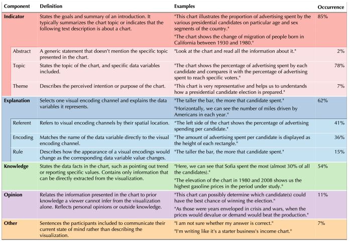
Explaining with Examples: Lessons Learned from Crowdsourced Introductory Description of Information Visualizations
Leni Yang, Cindy Xiong, Jason K. Wong, Aoyu Wu, Huamin Qu
Data visualizations have been increasingly used in oral presentations to communicate data patterns to the general public. Clear verbal introductions of visualizations to explain how to interpret the visually encoded information are essential to convey the takeaways and avoid misunderstandings. We investigate how to effectively introduce visualizations to the audience with varying degrees of visualization literacy.
IEEE VIS 2021
Visual Arrangements of Bar Charts Influence Comparisons in Viewer Takeaways
Cindy Xiong, Vidya Setlur, Benjamin Bach, Kylie Lin, Eunyee Koh, and Steven Franconeri
To help a viewer intuitively compare values to quickly generate key takeaways, visualization designers can manipulate how data values are arranged in a chart to afford particular comparisons.
IEEE TVCG 2021
Declutter and Focus: Empirically Evaluating Design Guidelines for Effective Data Communication
Kiran Ajani, Elsie Lee, Cindy Xiong, Cole Nussbaumer Knaflic, William Kemper, and Steven Franconeri
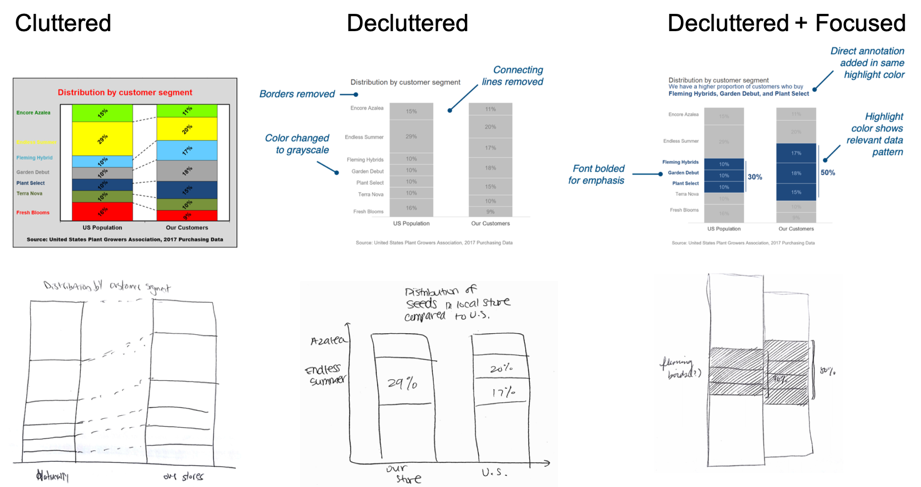
To more clearly communicate data, consider including a clear headline that describes the relevant data pattern, highlighting a subset of relevant data values with a unique color, and connecting those values to written annotations that contextualize them in a broader argument.
[PDF][Video]
[More on VisxVision]
IEEE VIS 2020
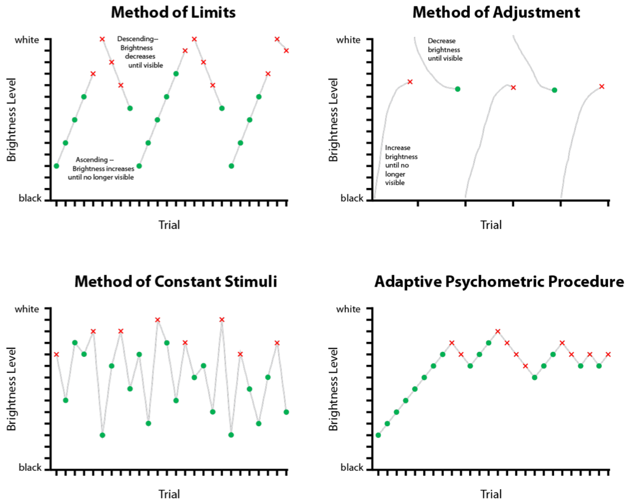
🏆 A Design Space of Vision Science Methods for Visualization Research.
Madison A. Elliott, Christine Nothelfer, Cindy Xiong, Danielle Albers Szafir
We introduce a design space of experimental methods for empirically investigating the perceptual processes involved with viewing data visualizations to inform visualization design guidelines. We advocate for a deeper relationship between human perception and visualization research to extend the methodological design space for understanding visualization and human vision. Join us here.
[PDF]
IEEE VIS BELIV 2020
How to Evaluate Data Visualizations across Different Levels of Understanding.
Alyxander Burns. Cindy Xiong, Steven Franconeri, Alberto Cairo, Narges Mahyar
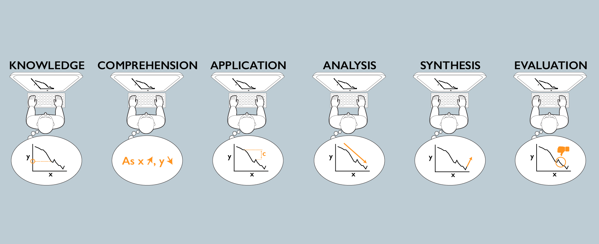
Understanding a visualization is a multi-level process. A reader must extract and extrapolate from numeric facts, understand how those facts apply to both the context of the data and other potential contexts, and draw or evaluate conclusions from the data. We diagnose levels of understanding of visualized data by adapting a common framework from the education literature.
IEEE VIS 2020
Truth or Square: Aspect Ratio Biases Recall of Position Encodings.
Cristina Ceja, Caitlyn McColeman, Cindy Xiong, Steven Franconeri
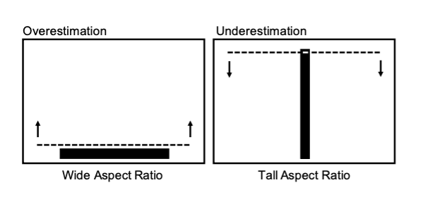
Bar charts are among the most frequently used visualizations, yet people's recall of bar marks' position can be biased. Viewers are biased to remember a bar mark as being more similar to a prototypical square, leading to an overestimation of bars with a wide aspect ratio, and an underestimation of bars with a tall aspect ratio.
IEEE TVCG 2019
The Curse of Knowledge in Data Visualizations.
Cindy Xiong, Lisanne van Weelden, Steven Franconeri
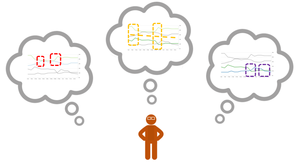
Two people can see different patterns in the same visualization, potentially leading to miscommunication. We show that when people are primed to see one pattern in the data as visually salient, they believe that naïve viewers will experience the same visual salience.
IEEE VIS 2019
llusion of Causality in Visualized Data
Cindy Xiong, Joel Shapiro, Jessica Hullman, Steven Franconeri
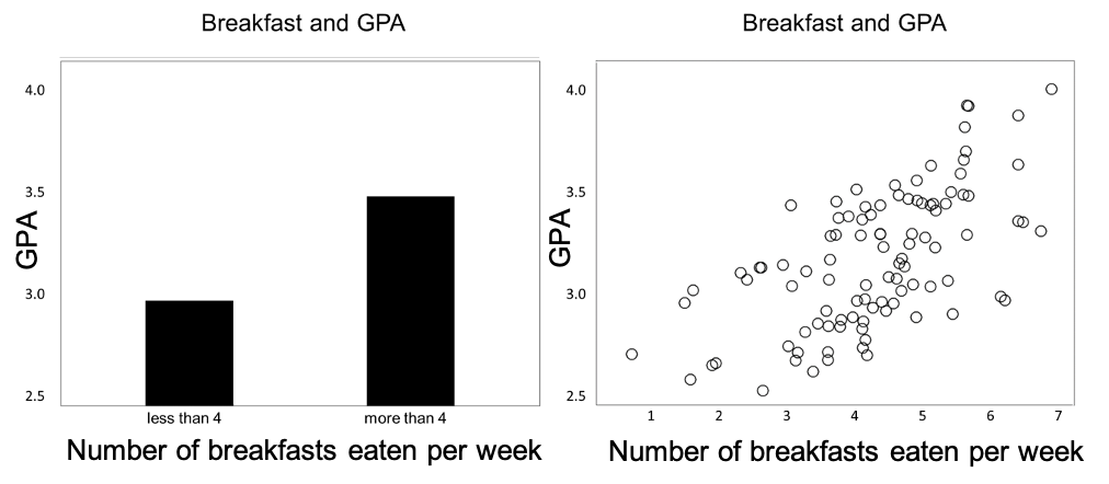
Students who eat breakfast more frequently tend to have a higher grade point average. From this data, many people might confidently state that a before-school breakfast program would lead to higher grades. This is a reasoning error because correlation does not necessarily indicate causation – X and Y can be correlated without one directly causing the other. While this error is pervasive, its prevalence might be amplified or mitigated by the way that the data is presented to a viewer.
IEEE VIS 2019
Biased Average Position Estimates in Line and Bar Graphs: Underestimation, Overestimation, and Perceptual Pull
Cindy Xiong, Cristina R. Ceja, Casimir J.H. Ludwig, Steven Franconeri
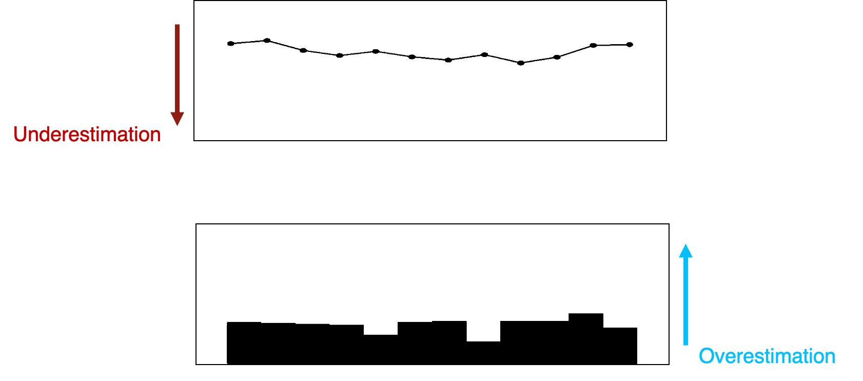
In visual depictions of data, position (i.e., the vertical height of a line or a bar) is believed to be the most precise way to encode information. We show that reports of average position across a short delay can be biased such that line positions are underestimated and bar positions overestimated.
[PDF]
EuroVis TrustVIS 2019
Examining the Components of Trust in Map-Based Visualizations
Cindy Xiong, Lace Padilla, Kent Grayson, Steven Franconeri
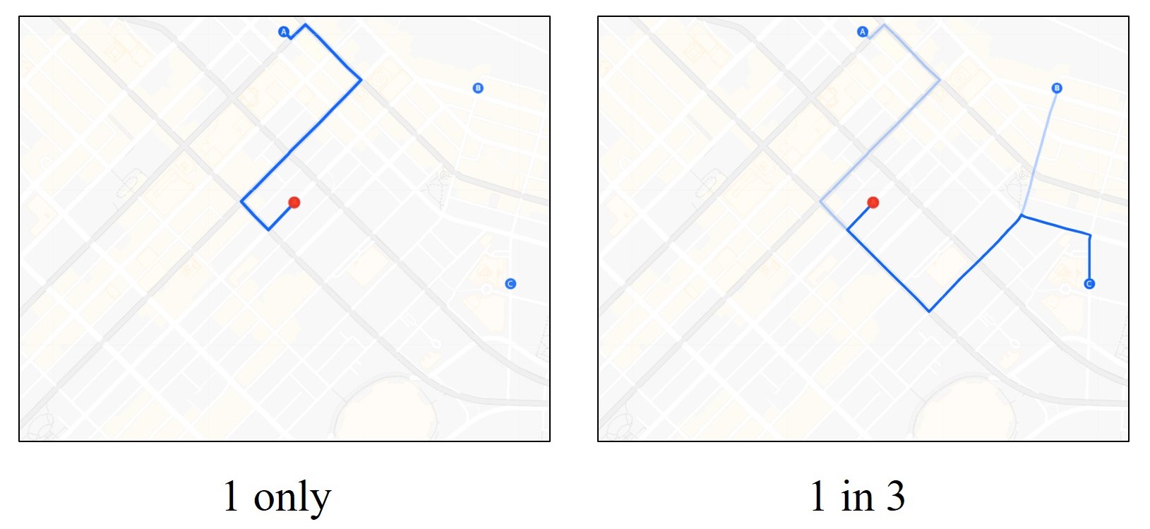
Perceived transparency is often associated with perceived trust, and greater transparency in data visualization can be associated with an increase in the amount of information. We showed that perceived clarity, amount of disclosure. and thoroughness significantly predicted individuals’ selection of a Google Maps-like application with either less information or more information.
[PDF]
International Music Perception and Cognition Conference 2016
Perceptual learning of abstract musical patterns: Recognizing composer style
Carolyn A. Bufford, Khanh-Phuong Thai, Joselyn Ho, Cindy Xiong, Carly A. Hines, Philip J. Kellman
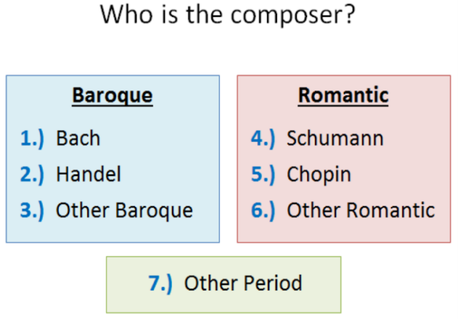
How can we improve abstract pattern recognition in music? Can principles enhancing visual learning be extended to auditory stimuli, such as music? Perceptual learning, improvements in the pickup of information from experience, is well-established in both vision and audition. We showed that perceptual learning training can improve participants’ recognition of composers’ styles, demonstrating that composer style can be learned, and perceptual-learning-based interventions are effective in complex auditory domains.
